Table of Content
- What is Color Psychology?
- Why is Color Psychology Important for Branding and Marketing?
- How Does Color Affect Human Psychology, Behavior, and Emotions?
- How to Use Color Psychology in Branding and Marketing?
- How to Choose Your Brand Colors?
- How Your Online Brand Can Benefit from Color Psychology?
- Conclusion
It just takes 90 seconds to form a first impression of a product. In the world of branding and marketing, where first impressions are everything, the power of perception reigns supreme. Every element, from your logo to your website, plays a crucial role in how consumers perceive your brand. Amidst this complex interplay, one factor stands out as a silent yet potent influencer: color.
Welcome to the mesmerizing realm of color psychology, where hues aren't just aesthetic choices but profound tools that shape our emotions, behaviours, and decisions. In this journey, we'll uncover the magic of color psychology and explore why it's an indispensable ally for anyone navigating the turbulent seas of branding and marketing. Buckle up as we dive into the enchanting world where science meets art and where colors aren't just shades but storytellers of the mind.
What is Color Psychology?
Color psychology is the art and science of understanding how colors affect human thoughts, feelings, and behaviours. It's the realm where aesthetics meet the human psyche and where every shade holds the potential to sway our perceptions. This intriguing field of study delves deep into the emotional and psychological impact of colors, revealing their unique ability to evoke specific responses within us. Whether it's the warm embrace of red or the soothing coolness of Blue, each color has a story to tell, a message to convey, and an emotion to awaken.
Why is Color Psychology Important for Branding and Marketing?
In the era of branding and marketing, where competition is fierce, and attention spans are fleeting, standing out is paramount. That is where color psychology comes into play. It's not just about choosing a good color scheme; it's about crafting an identity that profoundly resonates with your target audience. Just like types of brand names, color psychology helps you create a brand identity that speaks to the hearts and minds of consumers, making your brand memorable, relatable, and persuasive. In a nutshell, it's all about the colors that impact how buyers perceive different brands and products, so picking the ones that align with your business's goals and target audience is crucial.
How Does Color Affect Human Psychology, Behavior, and Emotions?
Understanding the color psychology behind the colors allows brands to tap into the emotions and associations they evoke, effectively influencing consumer behaviour and decision-making. Colors have an incredible impact on our psychology, behaviour, and emotions. Let's take a closer look at some of the critical players of color psychology in the palette of our minds:
Red: Passion, Excitement, Danger Make
The color red is an attention-grabber. It's associated with strong emotions like passion and excitement. It's often used in marketing to create a sense of urgency, making it a popular choice for sale signs and calls to action. However, it can also evoke feelings of danger or caution.
Brand Example: Coca-Cola

Imagine a world without the signature crimson hue of Coca-Cola. It's nearly impossible. The world's most iconic beverage brand has made red its eternal companion with color psychology, and for a good reason.
When you pop open a Coca-Cola, you're not just indulging in a soda; you're sipping a dose of joy, a splash of celebration, and a burst of energy. The color red embodies these sentiments perfectly. It ignites your senses, tantalizes your taste buds, and sparks that fizzy, effervescent feeling we all associate with Coca-Cola.
So, the next time you see that iconic red can or bottle, remember that it's not just a color; it's an invitation to refresh your spirit and celebrate the moments that matter. Coca-Cola's use of red isn't just branding; it's pure, unadulterated magic in a bottle.
Blue: Trust, Stability, Calmness
Blue is a color that exudes trustworthiness and stability. Banks, tech companies, and healthcare providers often use it to convey a sense of reliability. According to Adobe’s Analysis, 33% of world’s top 100 brands uses blue color in their branding. The color psychology of Blue can also create a calming effect, making it suitable for brands aiming to reduce anxiety or stress.
Brand Example: Facebook

In the vast digital landscape, where billions of people seek connection, one color reigns supreme: blue. Facebook, the social media behemoth, has chosen Blue as its brand's true north, and the reasons are as profound as they are simple.
Facebook understands the vital importance of trust when it comes to online relationships. Blue embodies this trustworthiness, urging users to share their thoughts, photos, and lives with confidence.
But it is more than just a social network; it's a bridge between individuals, cultures, and continents. With its universal appeal, Blue transcends borders and languages, making it the ideal choice for a platform that seeks to unite the world.
Green: Nature, Freshness, Growth
Green is the color of nature, symbolizing freshness and growth. Eco-friendly brands, health products, and organic foods frequently use it. The color psychology of green is that it connects with our desire for a healthier, more sustainable world.
Brand Example: Starbucks
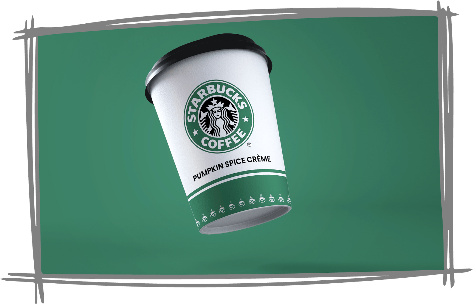
As you step into a Starbucks, you're greeted by an unmistakable shade of green—a hue that embodies the essence of this global coffeehouse chain. Why green, you may wonder? Well, it's not just a choice; it's a philosophy of color psychology.
Imagine sipping freshly brewed coffee, surrounded by earthy decor and bathed in the soothing green glow. It's an invitation to connect with nature, to pause in a bustling world, and to savour life's simple pleasures. The color psychology of green transcends the café walls, extending to Starbucks' commitment to sourcing ethically and reducing its ecological footprint.
Moreover, green is associated with health and vitality. It mirrors the wholesome ingredients that Starbucks uses, from coffee beans to fresh pastries and wholesome snacks. It reminds you that your cup of coffee is not just a drink; it's a conscious choice for a better, greener world.
Yellow: Happiness, Optimism, Creativity
Yellow radiates warmth and positivity. It's the color of sunshine and happiness, making it ideal for brands that want to convey optimism and creativity. The color psychology of yellow is that it can grab attention and inspire action, making it a great choice for call-to-action buttons.
Brand Example: McDonald's

Picture the most famous fast-food brand globally, and you'll likely conjure the vibrant image of McDonald's iconic golden arches set against a sunny backdrop. Yellow is the radiant hue that defines this beloved brand, and its choice is a feast for the senses.
Yellow is the color of sunshine on a perfect day, the gleam in a child's eye when they spot their Happy Meal, and the zest for life that McDonald's aims to deliver with every bite. McDonald's understands that visiting their restaurant isn't just about nourishment; it's a color psychology experience that begins with a warm, inviting smile and a burst of sunny yellow.
Orange: Energy, Excitement, Enthusiasm
Orange is a vibrant color that exudes energy and enthusiasm. It's often used to create a sense of excitement and fun. Brands that want to stand out and inspire action often turn to orange to convey their message through their color psychology.
Brand Example: Home Depot
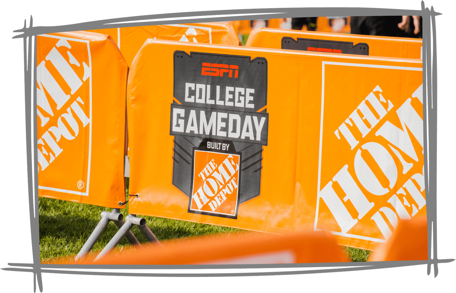
Step into a Home Depot store, and you're immediately immersed in a world of vibrant orange. It's a color psychology that's impossible to ignore and perfectly encapsulates the essence of this home improvement giant.
Home Depot understands that when you're embarking on home improvements, you're not just buying supplies; you're embarking on a journey of transformation. Orange is a visual motivator, igniting the spark of inspiration within customers.
But Home Depot isn't just a store; it's a haven for homeowners, DIY enthusiasts, and professionals alike. The color psychology of orange mirrors the passion and commitment of those who take pride in crafting, building, and beautifying their living spaces.
Purple: Luxury, Sophistication, Mystery
Purple is associated with luxury, sophistication, and mystery. It's a regal color often appeals to those seeking a touch of elegance and exclusivity. Perfume brands, high-end fashion, and tech companies sometimes choose purple as their color psychology to set themselves apart.
Brand Example: Cadbury

When indulging in chocolate's rich, velvety world, one brand has made purple its unmistakable mark: Cadbury. The choice of purple isn't just a coincidence; it's a carefully crafted branding masterpiece.
Cadbury understands that enjoying a piece of their chocolate isn't just about satisfying a craving; it's about savouring an exquisite experience. But it is more than just a chocolatier; it's a brand that elevates everyday moments into extraordinary ones. Just as kings and queens adorned themselves in purple robes, the color psychology of Cadbury envelops its treats in this majestic hue, reminding customers that they deserve nothing but the best.
Pink: Love, Romance, Femininity
Pink is a color closely linked to love, romance, and femininity. It's often used in products and branding aimed at women or to convey a sense of sweetness and charm. The color psychology of pink can evoke feelings of care and affection.
Brand Example: Barbie

Enter the enchanting world of Barbie, and you're instantly surrounded by a sea of pink. It's a color psychology that has become synonymous with this iconic doll, and its choice is a captivating journey into the realm of imagination and dreams.
Pink represents love, romance, and femininity. It's the color of innocence, wonder, and the boundless possibilities of childhood. Barbie understands color psychology, and when a child plays with one of their dolls, they're not just engaging in a pastime but embarking on a grand adventure filled with stories and creativity.
Black: Power, Elegance, Sophistication
Black is the color of power and elegance. It's a classic choice for luxury brands and products. The color psychology of black can convey a sense of timelessness and sophistication, making it a staple in high-end fashion and premium services.
Brand Example: Apple

In the sleek and cutting-edge world of technology, one brand stands out with its minimalistic elegance: Apple. Its color psychology for black isn't merely a choice; it's a profound statement about design, innovation, and the future.
Black is the color of power, elegance, and sophistication. It's the embodiment of understated confidence and a commitment to the essentials. Apple understands color psychology, and its products aren't just gadgets; they're tools that empower individuals to shape their digital lives with style and substance.
Moreover, black is timeless. Just as a classic black suit or dress never goes out of style, Apple's products transcend fleeting trends, promising enduring functionality and beauty.
White: Purity, Cleanliness, Simplicity
White symbolizes purity, cleanliness, and simplicity. It's often used to create a sense of freshness and minimalism. Brands that want to convey a clean and modern image often incorporate white into their designs and color psychology.
Brand Example: Nike
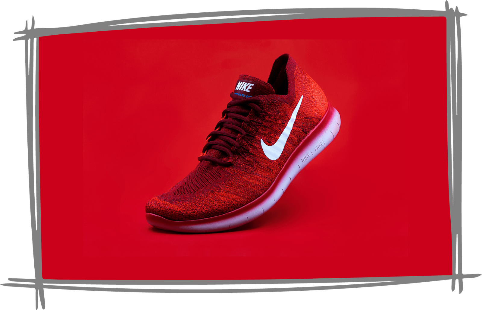
The only brand that stands out in spotless white in this fast-fashion sportswear brand is Nike. It represents the unlimited quest and opportunities for athletic achievement. Nike recognizes that their products are more than simply clothes and accessories; they are tools that enable athletes and enthusiasts to push beyond their limitations in a clean and focused manner. It's the color of aspiration, fostering athletes to dream, train, and perform to their full potential.
Furthermore, white is a uniting color. Just like the white of a finish line welcomes all runners, Nike's white logo represents inclusion and accessibility. They remind athletes that their path begins with a blank slate of pure potential, regardless of their background, skill level, or aspirations. So, the next time you put on your Nike sneakers or put on their clean sportswear, remember that it's more than just a hue; it's a color psychology and a call to pursue your athletic aspirations with purity and commitment.
How to Use Color Psychology in Branding and Marketing
Now that we've explored the psychology of individual colors let's dive into the practical aspects of using color psychology in branding and marketing:
Align with Your Brand's Personality and Values
Your choice of colors should align with your brand's personality and values. For example, green would be a natural choice if your brand promotes eco-friendliness and sustainability. Blue might be your go-to color if you're a tech company striving for trust and reliability. Consistency in color choices across all your branding materials helps reinforce your brand's identity.
Create a Desired Emotional Response in Your Target Audience
Consider the emotions and responses you want to evoke in your target audience. If you're in the fitness industry and want to motivate people, vibrant and energetic colors like orange or red can be effective. If you're in the healthcare sector and want to instil trust and calmness, a palette of blues and greens would be more appropriate according to the color psychology we have seen previously. Homegrown brands can primarily utilize creative branding services from established agencies due to their domain knowledge and expertise.
Guide the User's Eye Through Your Website or Marketing Materials
Colors can be used strategically to direct the user's attention. For example, call-to-action buttons in a contrasting color can draw the eye and prompt action. A well-designed color scheme on a website can guide visitors to critical information and keep them engaged.
Create Visual Harmony and Contrast
Balancing colors is essential to prevent overwhelming your audience. Using complementary or analogous colors can create visual harmony while contrasting colors make specific elements stand out. Color psychology is about finding the right balance to ensure your brand's message is clear and memorable.
How to Choose Your Brand Colors
Choosing your brand colors is a critical decision that requires careful consideration. Here are some steps to help you make the right choice:
Understand Your Target Audience
Consider the preferences and emotions of your target audience. What colors resonate with them? What emotions do you want to evoke?
Research Your Competitors
Analyze the color palettes of your competitors. You want to stand out while still fitting into the industry landscape.
Connect with Your Brand's Identity
Reflect on your brand's personality, values, and mission. What colors align with your brand's essence?
Test and Iterate
Don't rush the decision. Test different color combinations and gather feedback. Sometimes, minor adjustments can make a big difference.
Consider Cultural Factors
Be aware of cultural associations with colors. A cheerful color in one culture may have a different meaning in another.
How Your Online Brand Can Benefit from Color Psychology
In the digital age, where online presence is paramount, leveraging color psychology is even more critical. Here are some ways your online brand can benefit:
Improved User Experience
A well-thought-out color scheme enhances the user experience on your website. It makes navigation intuitive and encourages visitors to explore further.
Enhanced Brand Recognition
Consistency in color use across your digital platforms helps brand recognition. Users who see your brand colors should instantly associate them with your brand.
Increased Conversion Rates
Using colors in call-to-action buttons and forms can boost conversion rates. The right color can prompt users to take the desired action, whether purchasing or signing up for a newsletter.
Emotional Engagement
Color psychology can evoke emotions online, just as in the physical world. You can foster emotional engagement with your brand by choosing colors that resonate with your audience.
Accessibility and Inclusivity
Consider accessibility guidelines when choosing colors for your online brand. Ensuring that your website is accessible to all users, including those with visual impairments, is ethical and broadens your reach.
Conclusion
In the intricate dance of branding and marketing, color psychology is the hidden choreographer that can either make your brand shine or fade into the background. Science transforms colors into messengers of emotion and the art that speaks to the human soul. By understanding the psychology of individual colors, strategically using them in your branding and marketing efforts, and choosing your brand colors wisely, you can harness the potent magic of color psychology to create a brand that not only appeals to the eye but also captures the hearts and minds of your audience. So, the next time you see a logo or a website, take a moment to appreciate the colors used—they might tell you a story you never knew you were hearing.
As you embark on your branding journey, remember that every hue carries a message, and every shade has a story to tell. To navigate this vibrant landscape with expertise and finesse, turn to a partner who truly understands the art and science of color psychology. Brand Board Media- creative branding agency in Ahmedabad is that partner, guiding you towards the perfect color palette to shape your future businesses. Let's paint a brighter, more compelling tomorrow together.
Our expert team understands the nuances of color psychology. It is eager to collaborate with you to craft a branding strategy that resonates with your audience, elicits desired emotions, and drives meaningful engagement. Don't miss the opportunity to transform your business with the power of color — contact us now, and let's embark on a colorful journey to success.