Have you ever seen a logo and instantly thought, “Wow, I love this brand”? Well, that reaction isn’t accidental, it’s often sparked by the power of colour.

According to Carleton University's The Print Shop's content piece, "Colour sets the mood of brand expression. Emotions are powerful and can drive decision making."
The statement feels just right. Colours can spark emotions and feelings, allowing humans to connect instantly. Moreover, it significantly influences purchase decisions.
The overall impact colours have on human minds makes them a crucial and strategic selection for a brand and its marketing material.
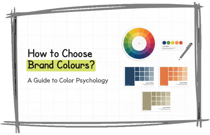
We know what you’re thinking: Enough about colour psychology, how do I actually choose my brand colours? We understand the question - how to choose brand colour now hovers over your head. Without further due, let's get in!
Brand Colours: What are they?
Brand colours are the specific shades and hues your business consistently uses across all marketing channels: from your logo and website to packaging and social media. Brands often choose colours that align with their values, vibe, and personality.
Step 1: Define Your Brand Personality
Before determining the brand colours, understanding and finalizing your brand personality is a must. This involves deciding on the values, characteristics, and overall personality - bold, calm, professional, quirky, or energetic. If defining your brand personality feels challenging, partnering with a creative branding service can help you translate your values into a powerful visual identity.
Step 2: Understand the psychology behind colour
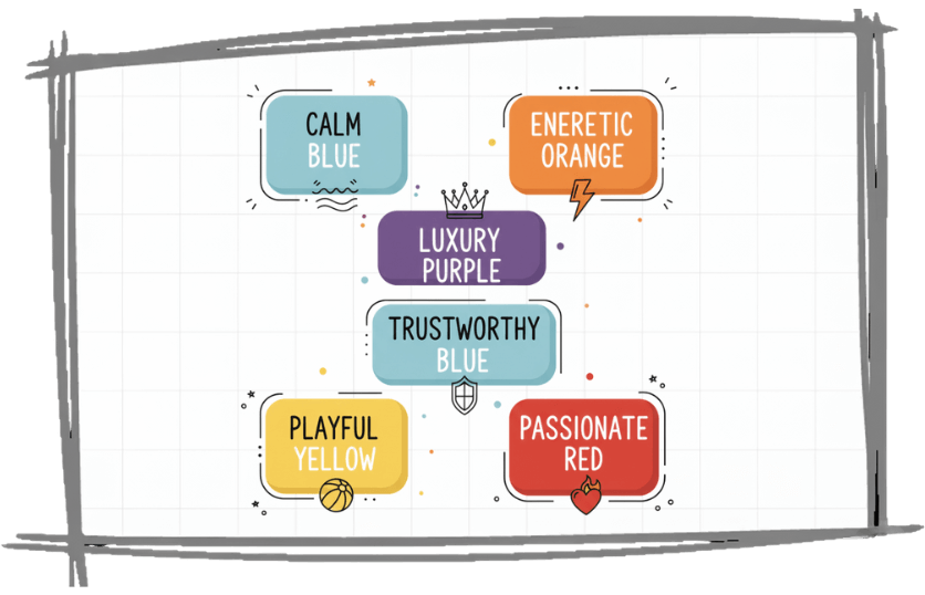
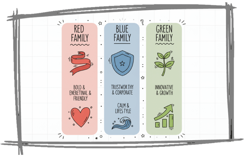
Colour psychology highlights the ways colour influences emotions and behaviours. Understanding how specific colours affect people's psychology helps you determine how people perceive the brand. You can leverage the results for strategies in the design and marketing field. This will help you create compelling and memorable marketing campaigns.
Apart from understanding colour psychology, you must also focus on learning branding colour terminology. It includes colour hues, colour tint, colour shade, HSL colour codes, colour tone or saturation, RGB and HEX, and CMYK and PMS.
Step 3: Audit Your Market & Competitors
As you get the hang of colour theory and psychology, it is essential to research the market and competitor's brand colours. Identify what colours are prevalent in the industry and the reason behind them. Identify and create differentiation strategies accordingly to stand out from the competition.
Even if you use similar colours as competitors, the goal is to make your palette distinctly yours and instantly recognizable. One way to do so is by creating a mood board of palettes and choosing ideal combinations that suit your brand.
Step 4: Build Your Core Brand Colour Palette
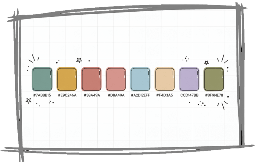
Now that you have core colour theory in place, it is time to choose and build your colour palette. Identify colours resonating with your brand personality and overall identity. It is essential to consider this since colours will become an identification of your brand.
You can start this by creating a mind map and shortlisting colours that best represent your business. Additionally, you can use a colour wheel to pick some shades and hues. Whether you choose two or six shades, aim for a balanced, cohesive, and memorable palette that aligns with your overall brand message.
Step 5: Test for Accessibility & Versatility
Once your colour options are finalized, test them across multiple platforms: digital, print, and merchandise, to ensure they’re versatile and accessible to all audiences. Use them in promotional creatives to understand how they feel. Analyze whether the colour represents your brand right. Do they look and feel cohesive?
While some colours may feel great in theory, they might not have the same appeal in reality. So, it is important to ensure your palette works amazingly well across physical and digital prints.
Brand Colours Real-World Examples
To visualize how brand colours work in practice, let’s explore some iconic examples from global brands.
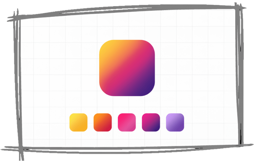
The app hosts 5 brand colours in its popular colour gradient. The brand's colour family includes yellow, pink, orange, purple, and magenta.
Uber
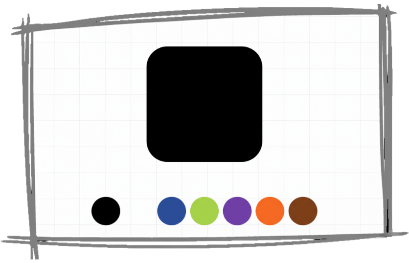
The branding style guides highlight Uber's nine colours used in its brand guidelines. The prominent colour family includes black, white (primary colours), safety blue (accent colour), green, orange, purple, and brown (secondary colours).
Zomato

Zomato’s branding revolves around a bold and confident red, symbolizing energy, passion, and appetite, emotions that perfectly align with the food delivery industry. Complementary colours like white and grey help balance the vibrancy, ensuring a modern and appetizing look across platforms.
Tools for Choosing Brand Colour
Several online tools help you choose brand colours. Some common ones are stated as follows:
Coolors
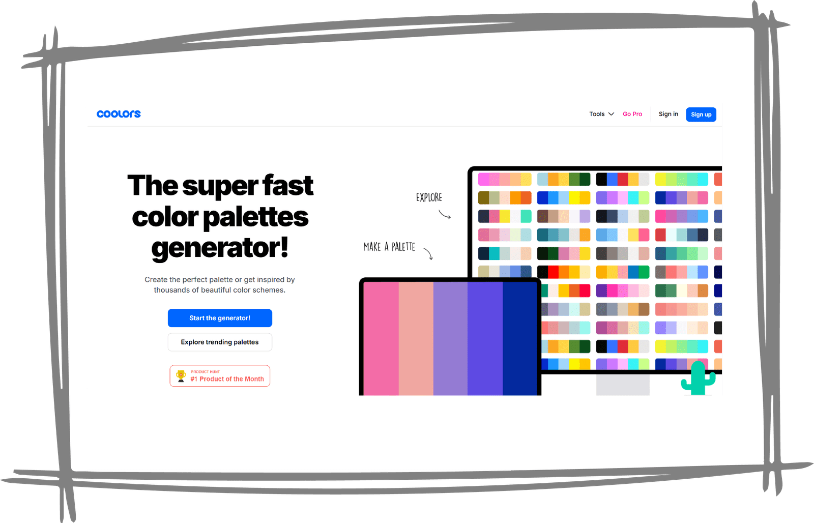
Website: https://coolors.co/
This beautifully designed website is a home to many hues and shades. It allows you to explore multiple colour palettes to lock down the desired scheme.
Adobe colour CC

Website: https://color.adobe.com/create/color-wheel
This powerful software allows you to customize the colour palette by following the colour rule. Before choosing, you need to select a rule from triad, monochromatic, complementary, and other options. Even if you don't know the colour theory, you can still build a beautiful palette by using this software.
Colour Hunt
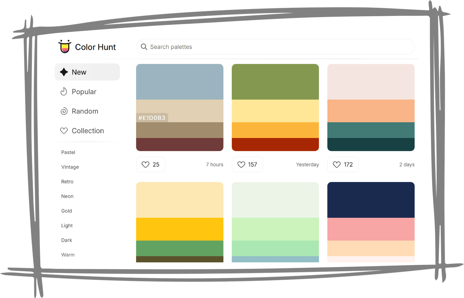
Website: https://colorhunt.co/
This software boasts multiple palettes put and shortlisted by the designers. The palettes are free to use and offer hex codes to ensure no confusion. Overall, they are a good choice for exploring colour combinations.
Frequently Asked Questions
Q. How many colours should a brand palette have?
Ideally, your brand palette can have anywhere between 2 to 6 colours. While some brands stick to simplicity and memorability by choosing two colours, some play with accent colours to make their branding more fun.
You can even try the 60-30-10 rule. Here, there are three main colours. The dominant colour covers around 60% of the brand, whereas the remaining two cover 30% and 10%.
Q. Can I use trending colours?
A hundred per cent. However, it is essential to consider how the trendy colour fits into the overall messaging, brand identity, and branding material. Whether you use trendy colours or not, don't forget to stay consistent with the core palette and maintain strong brand consistency.
Q. What if my industry already uses "my" colour?
Other brands in your industry can use a colour the same as your palette, especially if it's a popular one. If that's the case, do consider the colour's significance and impact on your industry.
To stand out from the competition while using the same palette or colour, you can use different strategies and combinations. Focus on creating a unique yet memorable identity.
Q. Why is colour important in branding?
Colour significantly influences the way customers perceive a particular brand and its offerings. They can induce emotions, ultimately establishing a connection on a deeper level. Additionally, consistency in brand colours helps establish brand identity. This allows customers to recognize and remember the brand easily.
Last but not least for the list, colours affect consumer behaviour by influencing purchasing decisions. This is particularly true when it comes to marketing materials.
Overall, the brand colour palette contributes to a positive brand experience.
Q. What colours are the best for logos?
There are no specific colours best for logos since it depends a lot on the brand's industry and personality. However, some popular brand colours include blue, red, and black. Blue: A dependable, trustworthy, and versatile colour. Black: A representation of simplicity, style, and elegance. Red: An epitome of energy, passion, and action.
So, which colour should you choose?
Brand colour selection is fun but, sadly, not a game. It is not about choosing combinations you like the best. Instead, it requires careful consideration of factors like industry, brand identity, and audience perception.
The final decision is yours, but if you would like expert support, our team at Brand Board Media, a leading creative agency in Ahmedabad, is here to help you choose colours that truly represent your business. Contact us, or get on the quick call with us on +919712881888.